The Complete Guide to Event Planner Logos: Ideas, Tips, Examples
Want to make your event planning company stand out? Event planner logos are a great way to do exactly that.
Whether you’re part of a team or flying solo, just getting started or an industry veteran, great marketing begins with a proper logo. But it goes well beyond simply hiring someone to design an eye-catching logo for you. That's where this guide comes in.
Keep reading to take a deep dive into the world of event planner logos. Explore examples, ideas, tips, and more, and you'll be well on your way to having a logo that stands out from the competition. But first, here’s why event planner logos are so important:
According to the experts at Design Powers, a good logo is memorable, differentiates you from everyone else, and fosters brand loyalty. And the science behind branding supports this statement.
A study on creating effective logos explains that when competition is fierce, a great logo can set event planners and other businesses apart from the crowd. The study goes on to point out that, Taco Bell spends 20 times more on its permanent media ” signs that carry only its name and logo ” than it spends on advertising. Also, Nike’s swoosh has become so prominent that the company’s ads often do not even mention the name.
So clearly, this visual element of your branding package is something worthy of serious consideration.
8 examples of event planner logos (and what makes them so special)
Take a look at the below examples ” created by the graphic design community at 99designs ” as a source of inspiration. Find out what makes each logo special, how you can implement some of the tactics in your own logo design, and much more.
1. Make it personal.

Key features: Charming illustration, bold design, playful fonts
Who said your event planner logo can only be words? Make it even more personal by adding a character in your likeness to it like this example did. Not only will it help make your logo stand out but it will also help your customers attach a person to the name.
Takeaway: Bring yourself to your logo design ” literally!
2. Define your services.
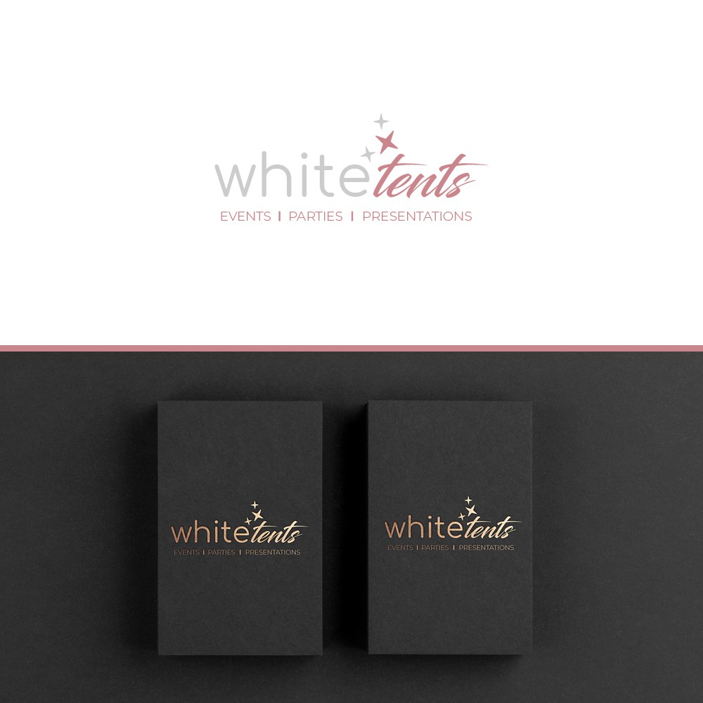
Key features: Services stated clearly, variety of fonts and colors
With a logo that defines your services, potential clients will know exactly what you do without any further explanation. Whether they find you online or take a business card, they’ll be sure to think of you when they need one of these specific services. Limit the services you showcase on the logo to your top 2 or 3 most popular options to maximize impact.
Takeaway: Sometimes literally spelling out what you do for clients in your event planner logo is the best option. Pro tip: Make sure you keep any wordy designs large and clean enough that when you resize it for social media it’s still easy to read.
3. Match your niche.

Key features: Cartoon illustrations, smiling kids and animals, and fun props
Elegant script and flowers on event planner logos are nice, but if you’re a children’s party planner like in this example, you can get way more specific. In this example, the bright colors and imagery all represent what clients can expect when they contact this professional.
Takeaway: Consider what styles and design elements are traditionally associated with your chosen niche then incorporate those into your event planner logos.
4. Advertise your uniqueness.
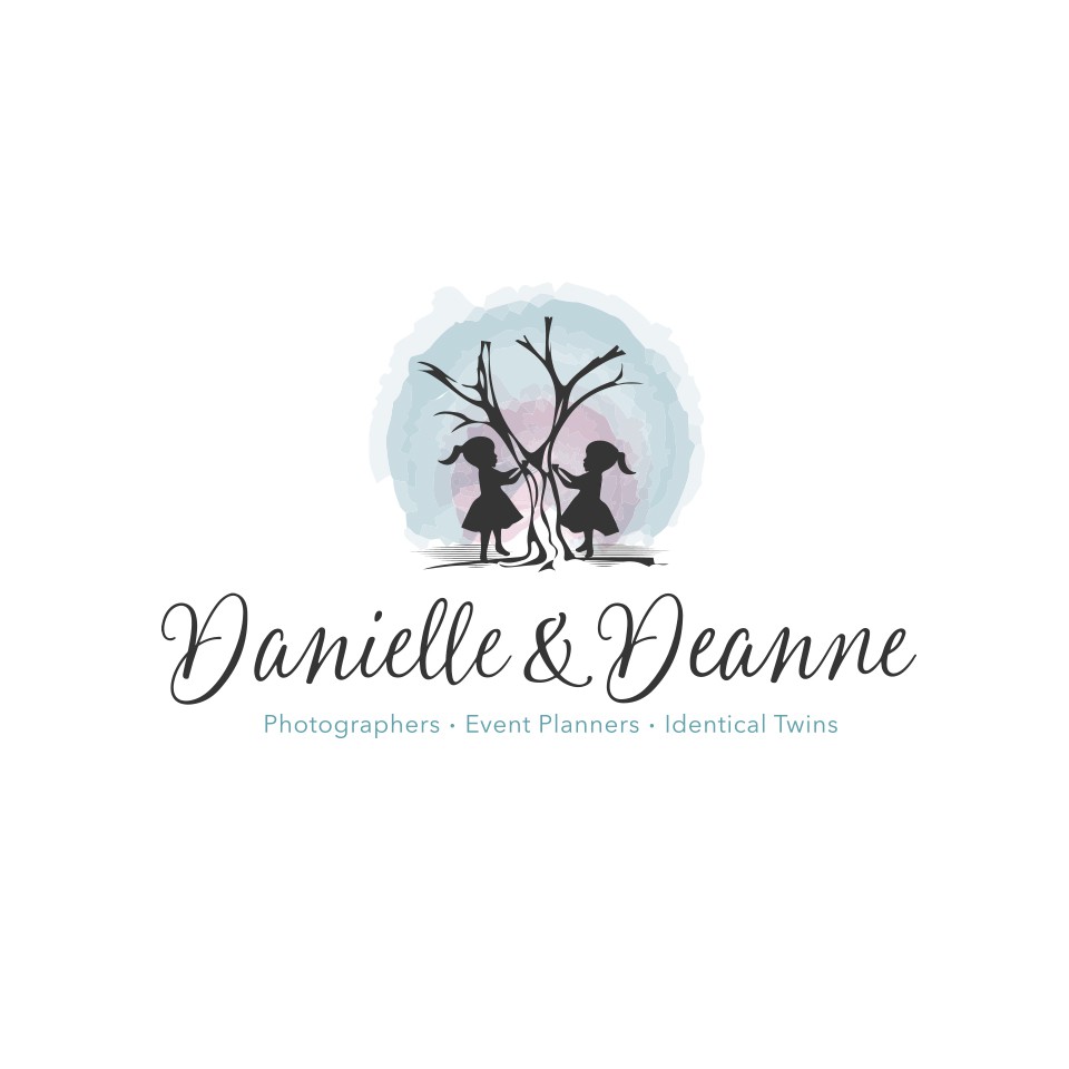
Key features: Names, services, and an illustration that best represents them
If you’re highly skilled but surrounded by other highly-skilled competitors, why not show off something personal that makes you stand out? In this example, the event planning team is made up of twin sisters. They added a symbolic illustration to showcase this fact. It’s a great conversation starter and really easy to remember.
Takeaway: Your personal life or interests can be used to make your event planner logo stand out even more.
5. Add brand colors.
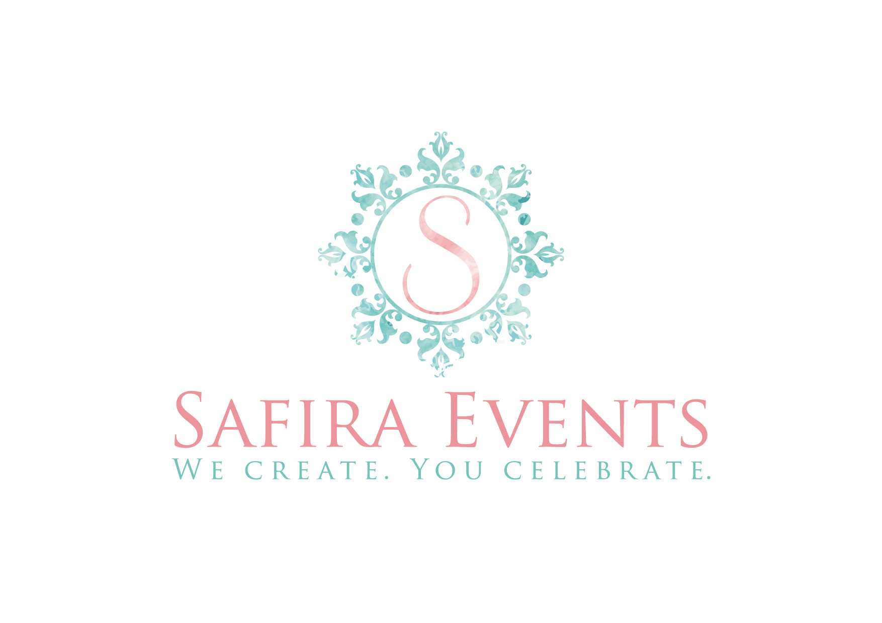
Key features: Pink and blue typography, a emblem, and a tagline
Skip the neutral color palette and go with one that you already use for your other branding. This event planner logo example could have paired the blue or pink with black, but they instead chose to make it pop by pairing the two.
Takeaway: Create a cohesive feel to your brand by using the same colors (or color family) in your logo as you do on your other marketing materials.
6. Include strategic symbols.
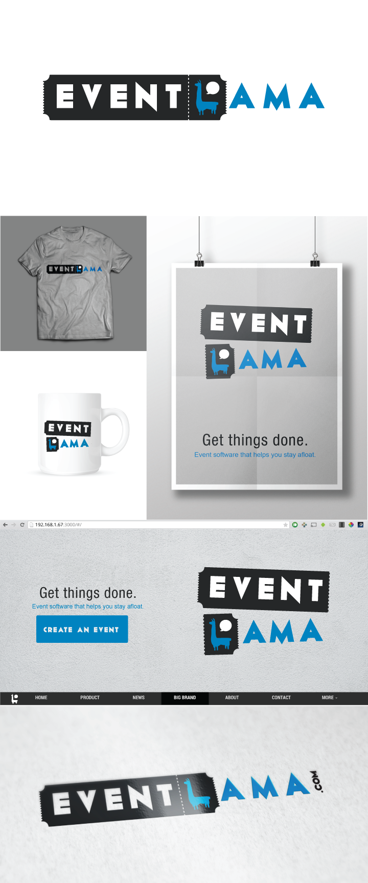
Key features: Fun character, symbolic shape, contrasting colors
This event planner logo offers two different options: one with the ticket torn and one without. Keeping the llama character on the stub means that they can easily add this smaller version of the image to marketing materials like hats and water bottles.
Takeaway: Consider the history and associations of symbols you can use in your event planner logo that make even a deceptively simple design more meaningful.
7. Tell a story.
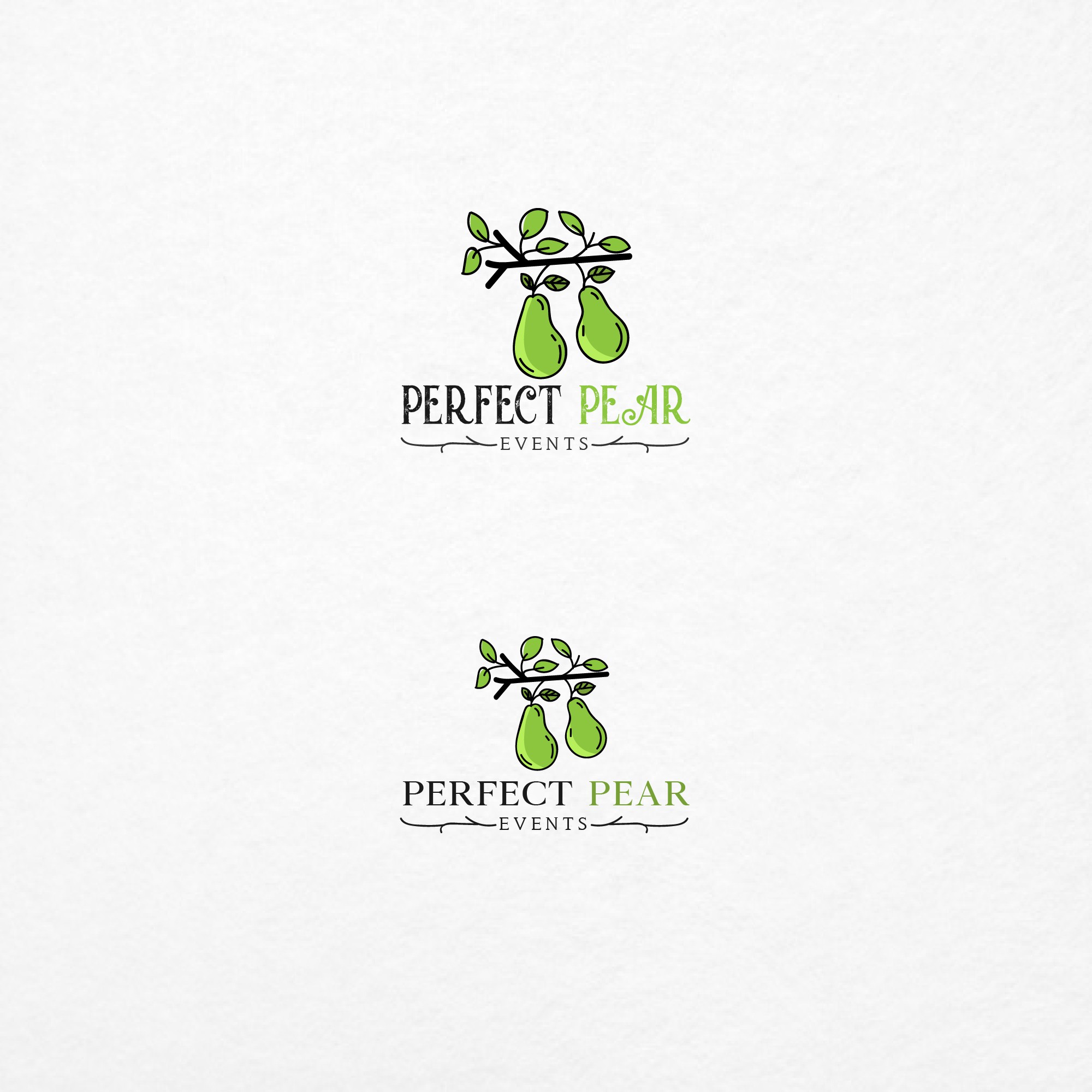
Key features: Clean design, strategic color, play on words
This event planner logo says a lot without saying much. Just by looking at it, potential clients can infer that Perfect Pear Events is run by two people who work together flawlessly and whose strengths complement each other. Additionally, the use of the color green can evoke feelings of growth, renewal, life, peace, security, and more, and the use of the branches underlining Perfect Pear is a strong and creative way to draw attention to the company's name.
Takeaway: Consider your logo and branding when coming up with your event company name.
8. Include your location.
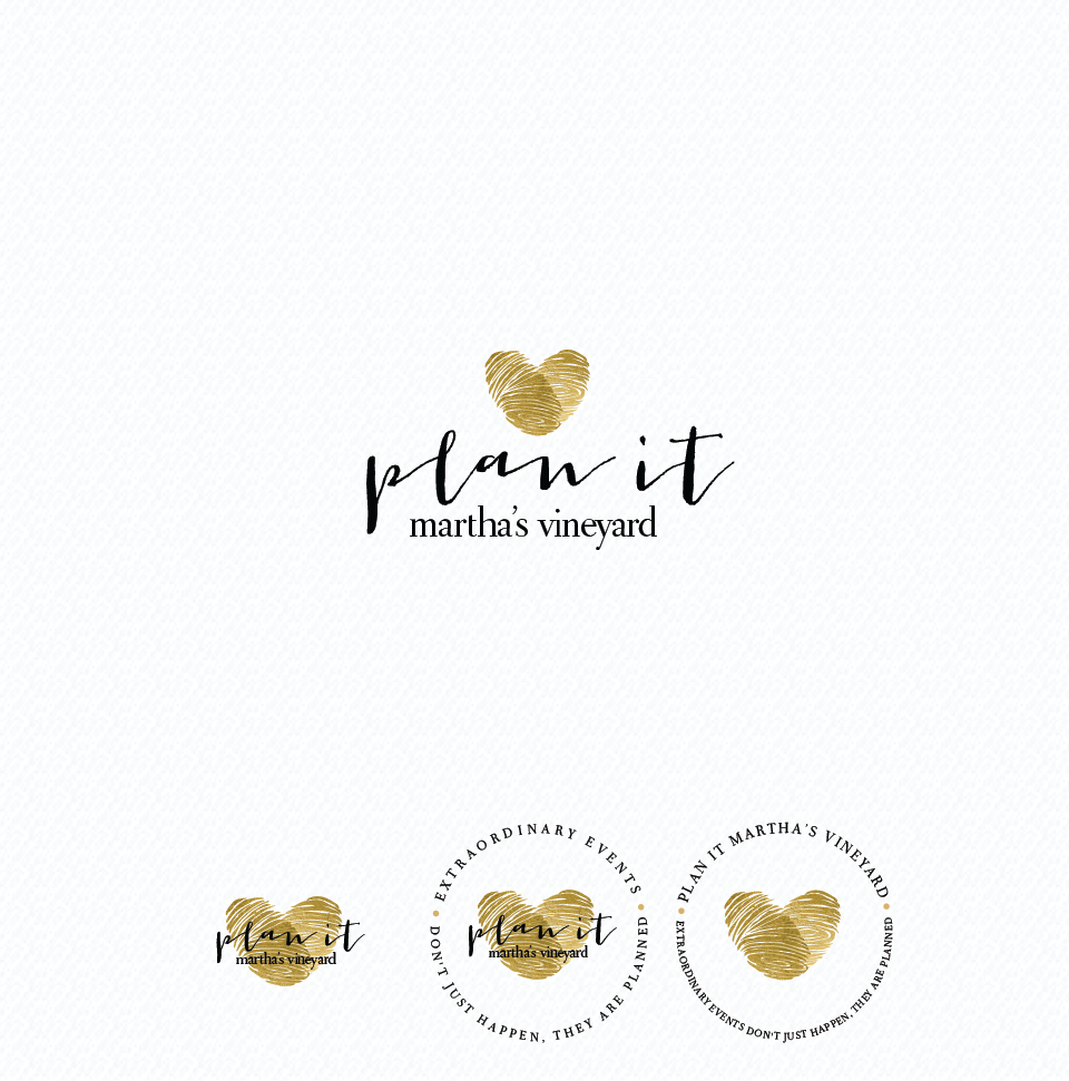
Key features: Minimalist design, classy color scheme, strategic symbols
This event planner logo is simple yet effective. It includes a strategic heart made out of two thumbprints, representing the personal touch the company puts on events, as well as the location it serves. Right away, potential clients know that this is a planning company located in Martha's Vineyard ” a great strategy for single planners or small companies who don't provide their services in multiple locations.
Takeaway: Highlighting the area you serve in your logo is an easy way to attract local clients.
How to create event planner logos in a few simple steps:
1. Consider your niche.
For example, wedding planner logos typically look best with either black and white or soft color palettes. On the other hand, luxury picnic planners should lean into boho and neutral hues, while children's party planners are best suited with bold, fun themes.
2. Research the competition.
You’ve seen some great sample event planner logos that cover a wide variety of styles. But it’s worth exploring what the competition in your local area is using, too. Check out 10-15 competing brands with similar types of event planning services. Mark their similarities and differences. Aim to create logo options that fit what people expect from brands like these but also has something unique that stands out from the rest.
3. Align team goals.
An event company logo might be just for you at the start, but as your team grows, you’ll want to consider what your shared purpose will be in the future. Having a north star now will solidify your mission statement and create a solid foundation for your logo design.
4. Choose words wisely.
Event planner names and logos require some thought. If you serve an international audience, make sure the words in your logo don’t translate to anything unprofessional. And if you use your own name, consider how different the design would look with one of your initials, both of your initials, or your whole name spelled out.
Put this event planner logo guide to good use today!
Your event planner logo says alot about you, what you do, and how you do it. Which is exactly why it’s good to learn how to do it well and take notes from the pros who have already been there, done that.
Up next, add your event planner logo to your own lead-magnetizing event planner website design. And, learn all about the secrets to event planning taglines that really work.

