
Friday Finds: 5 Must-Know Party & Event Color Secrets for Planners
Whether you’re designing an anniversary party color scheme, fine-tuning sophisticated wedding color combinations, or searching for hues to make your events pop, you probably often go by instinct. Some color choices ˜feel’ right for a particular event, while others ˜feel’ wrong.
While your intuition is a valuable starting point, there are other important things to know about event palettes. Your color choices can support (or undermine) the themes and goals of your events, evoke particular moods and responses from attendees, and influence the perception of event spaces. Here we explore the powerful impact of color in event design so you can choose palettes that spark engagement, interest, attention, and even joy.
Discover the keys to beautiful party and event color schemes
1. Differentiate among positive innate, cultural, and personal responses to color schemes.
The psychology of color has three components: innate, cultural, and personal. Let’s take a closer look at each.
- Innate: Research shows that reactions to red and blue are with us from birth. The takeaway: Red ramps you up (think fire) and blue eases you down (think clear blue skies).
- Cultural: Other reactions to color that feel intuitive are actually influenced by culture. Red’s ramp-up effect makes it the color of passion and danger in the US, for example (think red lipstick and fire engines), while in China, the color signifies joy, prosperity, and good luck. In fact, red is such an auspicious color in China that brides traditionally wear it on their wedding days. Brides in the U.S. wear white…a color associated with funerals in China. The potential for a cultural color faux pas is clear, so take a look at your event’s target audience.
- Personal: Other reactions to color simply vary by person. Yellow is my favorite; it’s so cheerful! one person might say, while his brother might say, Ugh, I don’t like yellow; it makes me look sallow. When designing for one client in particular, pay attention to their reaction to certain colors.
As you plan your event color schemes, differentiate among innate, cultural, and personal reactions to color. Make sure the event’s colors align with the cultural and personal preferences of your clients and event attendees, rather than your preferences.
To brainstorm color schemes quickly, the internet offers some fun and free color palette generators. For example, Coolors will generate color palettes at the click of a space bar. Easy-to-use controls let you lock in a certain color, select a color from an image, fine-tune the palette, or return to the palette you liked three clicks back.
2. Shift guest perceptions with palettes that make event spaces ˜feel’ expansive or cozy.
You can make an event space appear airier and more open with light colors”think whites, creams, and pale tints. Maybe a venue has an outdoor space perfect for wedding photos, but the interior is a little too dark for the couple’s taste. You can make this venue the perfect spot by adding light colors to the ballroom decor.
Ceiling drapes are helpful here: not only do they bring the ceiling into the decor, they bring color up to the ceiling. Light colors on the ceiling can make event rooms feel more spacious than they are in actuality, while dark or saturated colors can make large spaces feel opulent, rustic, or more intimate.
You can also use color to make event focal points stand out; use colors that pop to highlight a registration tent, buffet tables, or an event gaming station. Consider using a consistent, unique color for maps and signage at larger events, so attendees can easily see where to go or how to find more information.
With event diagramming software, you can show clients how a specific space looks with key colors in place, and where their design instincts are off base. Sure, an elegant gala may benefit from a burgundy and deep green palette, but these hues can create a claustrophobic feeling when used throughout the entire venue.
[Tweet “Make sure an event’s colors align with the cultural and personal preferences of your clients, rather than your own.”]
3. Colors combined with lighting fine-tune an event’s energy and mood.
Color isn’t just for decor items like linens, balloons, flowers and ceiling drapes; incorporating subtle or dramatic color into lighting can have a powerful impact on the overall vibe of the event.
First, you’ll want to decide on the amount and quality of the light necessary for the specific event. Business meeting? Knitting and needlework conference? Attendees at both of these events probably need full-spectrum, bright lighting. For a more intimate social experience, such as a wedding reception or an evening holiday party, attendees will appreciate lower light levels overall, diffuse lighting, and accent lighting.
Next, consider ways to incorporate particular colors into an event’s lighting. For a futuristic, tech-heavy event, you might pair brighter overall light levels with pops of blue or purple underlighting. A warm reddish-orange light emanating from punched tin lanterns lends a cozy and warm feel to rustic or outdoor evening events. Uplighting around the perimeter can jazz up an otherwise bland venue.
Consider using a gobo to project an image of your choice (business logo, bubbles, custom wedding crest) in the color of your choice on a backdrop, wall, ceiling, or dance floor. Other ways to incorporate event lighting design and color for a variety of effects include:
- Floating accent lights
- LED trees or branches
- Paper lanterns
- Marquee sign with a message of your choice
- Drop curtains with uplights
- LED-highlighted tents
4. Color is the key to immersive event experiences.
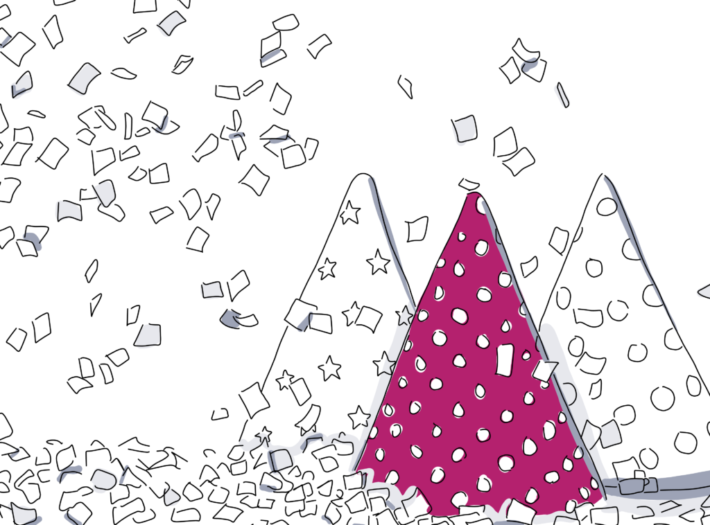
Draw from familiar color combinations for holiday event palettes. Independence Day’s red, white, and blue; Halloween’s black and orange; and Hanukkah’s blue and white, are some examples of clear color scheme choices. The celebration of a college basketball championship will no doubt feature the school colors. Use a tool like Sessions College Color Calculator to create expanded party color schemes that still look great with the foundation color(s).
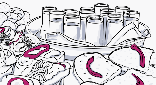
For events where the color choice is less obvious, use palettes that support the specific theme, whether it’s nature-inspired, minimalistic, tropical, or magical. For example, the tablescape for a nature-inspired company party could feature brown burlap table clothes, white and aloe-green runners and napkins, river stone table confetti, and succulents in reclaimed wood boxes as the centerpieces.
Other design elements where you can incorporate thematic color:
- Chair covers and sashes
- Backdrops: curtains, greenery, floral walls, peel-and-stick wall tiles
- Ceiling decor: lanterns, chandeliers, ceiling drapes
- Dance floors”solid color or shifting LED
- Garlands: balloons, flowers, paper, fabric, greenery
- Furniture: tabletops, couches, chairs
Many event design companies have Best of Pinterest collections or opportunities to Shop by Instagram. These are great places to look for event inspiration and to explore how other event designers use color in support of a theme or mood.

5. Colors can support your event goal”or undermine it! Choose wisely.
When designing an event for a company with a recognizable logo, the familiar hues of the logo should be incorporated into the event’s color scheme. The use of these colors builds positive associations between the company and the event, without stamping the logo on every napkin, balloon, and plate.
On the other hand, there are some color combinations you want to avoid. For example, unless you’re designing a retro event, you probably won’t mine the 70’s for its harvest gold, avocado green, burnt orange, and chocolate brown palette. In most contexts, such as business conferences or university symposiums, those specific colors will only confuse the message of your event.
Similarly, a DC Comics-themed event might use the familiar black and gold of Batman’s famed suit. But featuring the green and purple colors associated with rival Marvel Comics’ The Hulk would be considered a rookie mistake by attendees of a DC-focused event.
When designing for an unfamiliar group or subculture, always talk with your contact about colors they want left out, and those they want to feature front and center.
With a deeper understanding of the impact of color you can fine-tune your palette choices and, as a result, improve the overall energy of the events you design. This means successful events, happy attendees, and best of all”satisfied clients.
Ready to use colors in your next event? Check out 25 incredible fall event themes or stay ahead of outdoor event decor trends.
Get started with Social Tables!
Free Event Management Software for Planners and Properties

See Data Privacy Info
By clicking 'Sign Up', you consent to allow Social Tables to store and process the personal information submitted above to provide you the content requested. Refer to our Privacy Policy or contact us at privacy@cvent.com for more details.